A meticulously arranged flat lay of a complete brand identity system displayed on a warm grey linen surface. At the center sits a pristine white presentation folder with a bold, geometric logo, surrounded by matching letterhead, business cards, a minimalist envelope, and a sleek matte-black USB drive. Each piece shares the same refined color palette of deep navy, soft beige, and crisp white. Neutral overhead studio lighting evenly illuminates the scene, emphasizing paper textures, embossing, and subtle gloss finishes without harsh shadows. Captured from a pure top-down, bird’s-eye view, the composition uses precise spacing and alignment to echo professional design grids. The photographic, clean, and modern style communicates structure, consistency, and thoughtful brand creation.

Branding with human insight

I help entrepreneurs and organisations shape clear, confident brands that feel human, look distinctive, and speak with purpose—turning scattered ideas into stories people remember, trust, and choose.

Services

A high-end, neutral-toned brand strategy board pinned to a cork wall, filled with carefully arranged logo sketches, color swatches, typography samples, and printed mood images of abstract shapes and textures. A slim graphite pencil and a metal ruler rest on a narrow white ledge below the board. Soft afternoon light enters from the right, grazing across the board and casting elongated, elegant shadows that emphasize layers of paper and pinheads. Shot at eye level with a slight angle to create depth, the central area remains in sharp focus while edges fall into a gentle blur. The photographic realism and calm, professional mood suggest a thoughtful, strategic branding process in progress.

From naming to positioning, I build brand foundations that guide decisions, attract the right audience, and support long-term growth.

A close-up of a luxurious brand guideline book opened to a spread showing a logo usage page on the left and a color palette and typography system on the right. The book has a thick, textured off-white cover and heavy, satin-finish pages with precise printing and ample white space. It lies on a dark walnut table with a smooth grain, next to a neatly arranged stack of color swatch cards secured by a metal ring. Soft studio lighting from above creates even illumination, delicate highlights on the page edges, and subtle shadows along the book’s spine. Photographed from a low, side angle with a medium depth of field, the image feels refined, authoritative, and perfectly aligned with professional brand building.

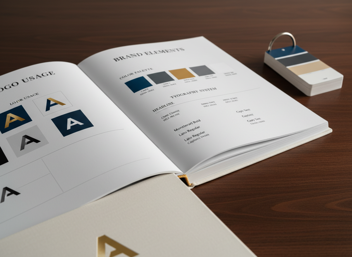
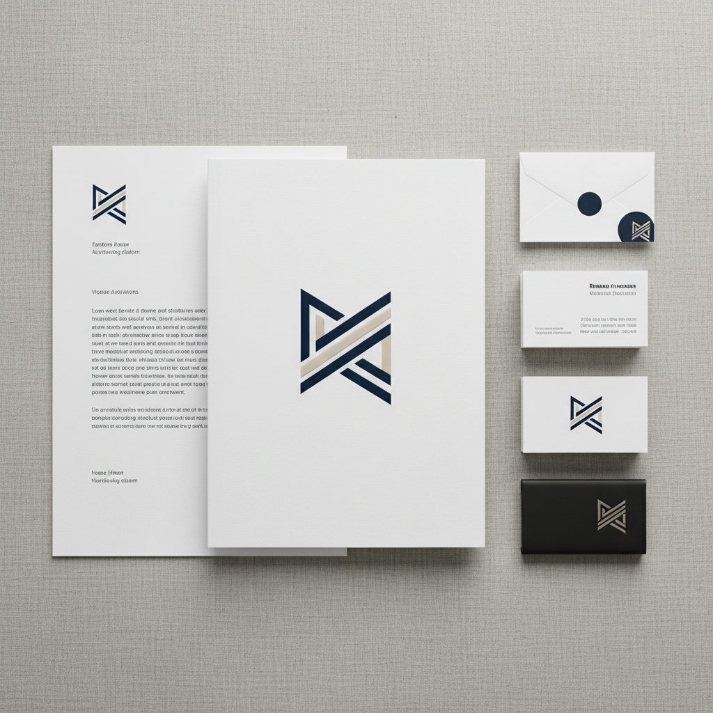
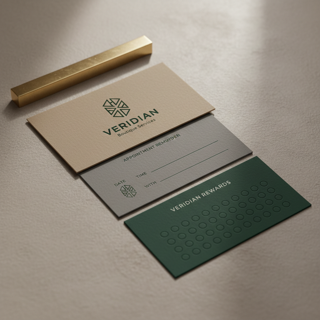
I translate strategy into flexible visual systems—logos, color, typography, and assets that keep every touchpoint consistent, distinctive, and recognizable.

An elegant product packaging concept consisting of a tall rectangular matte-white box and a matching cylindrical container, both adorned with a minimal, geometric logo and understated typography in charcoal grey. They stand on a seamless light beige backdrop, placed upon a low, square concrete plinth with a finely speckled surface. Directional studio lighting from the upper left creates a dramatic yet controlled contrast, with sharp, clean shadows falling to the right and subtle rim highlights defining each edge. Captured at eye level with a centered, symmetrical composition and crisp focus throughout, the photographic image feels bold, contemporary, and meticulously designed, ideal for showcasing sophisticated brand packaging.
A polished branding presentation scene on a large, ultra-thin monitor displaying a full-screen, minimalist brand case study slide featuring a logo, color blocks, and simple mockup imagery. The monitor sits on a clean, light oak desk with a satin finish, accompanied only by a wireless keyboard and a single branded notebook matching the colors on screen. Cool, diffused light from a wide window behind the camera softly illuminates the space, reducing glare while adding subtle reflections on the monitor’s bezel. Shot from a slightly off-center, eye-level perspective with a wide, cinematic framing, the photographic composition communicates clarity, professionalism, and the digital side of brand building.
A refined trio of brand collateral items for a boutique service brand: a vertically oriented business card, a folded appointment card, and a slim loyalty card, all in muted tones of stone, warm taupe, and deep forest green. They are carefully staggered on a soft, matte plaster surface, with a narrow brass paperweight holding the corner of the top card. Gentle side lighting from the right produces delicate shadows that highlight the thickness and quality of the card stock. Captured from a close, slightly elevated angle with shallow depth of field, the focus rests on the primary logo and typography. The photographic realism and understated mood emphasize tactility, elegance, and attention to detail in branding.

Reviews

Aya Nakamura

“Dylan uncovered the heart of our brand and turned it into a clear story—our clients instantly understood what made us different.”

Mateo García

“Working with Dylan felt collaborative and focused; he listened, challenged our thinking, and delivered a brand system our whole team champions.”

Insights

Work together

Share a few details about your brand, your challenges, and your timeline, and I’ll respond with next steps shortly.

← Back

Thank you for your response. ✨